


Have you ever noticed the widespread preference for simple logos in recent years? The design landscape has witnessed a surge in minimalist logo styles. But what prompts this inclination toward simplicity, and why are logos increasingly adopting uncomplicated forms?
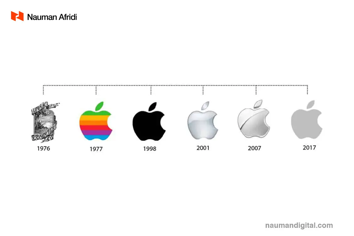
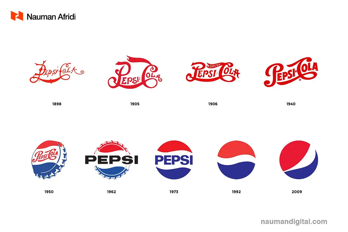
The shift toward simple logos is not a new trend; it has been a gradual evolution spanning several years. Examining logos of major brands like Starbucks, you can observe a clear reduction in design complexity over time. Even renowned car manufacturers such as Porsche have opted for a streamlined image, embracing cleaner and more straightforward designs.
The simplicity trend in logo design serves a fundamental purpose. It revolves around the concept that the fewer elements a logo has, the easier it becomes for individuals to recognize and remember a brand. This is especially vital in today’s visually overloaded market, where consumers encounter a plethora of logos daily.
Historically intricate logos, once symbols of authority, have given way to minimalist designs. These simpler logos not only possess visual appeal but also enhance practicality. By minimizing visual elements and focusing on core aspects such as colors and shapes, these logos offer unique and memorable visual cues, facilitating effortless brand recognition.
Let’s delve into the reasons behind the prevalence of simple logos in today’s design landscape.
Why are logos Becoming Simple?
The rise of uncomplicated logos can be attributed to memorability. In our modern, cluttered marketplace, where we encounter a multitude of logos daily, simplicity becomes a powerful tool for brand recognition.
Even if a company attempts to incorporate several unique elements into its logo, our brains have limitations in retaining information. Simple logos strategically reduce the visual overload consumers face.
These simplified forms are easier for consumers to recall when thinking about their favorite logos. Our brains naturally filter out unnecessary intricacies in logos and images, focusing on core elements. Consequently, there’s a practical advantage in keeping a logo straightforward and easily recognizable.
Historically, intricate logos were seen as symbols of authority and prestige. However, in the contemporary context, complex designs are viewed as impractical. They not only overwhelm consumers but also incur higher costs for placement on signs and packaging. Hence, the shift towards simplicity in logos aligns with the need for effortless recognition and efficient communication in our visually saturated world.
The Advantages of Simple Logos:
In the rapidly evolving digital landscape, Simple logos have many advantages over complex logos. These advantages are discussed in detail below
Visual Comfort:
The simplicity of logos offers distinct advantages over their complex counterparts, particularly in enhancing visual comfort. Although intricate logos might be visually appealing, they often strain the eyes, especially in the modern digital age where people constantly engage with various screens. Simple logos, on the other hand, are easier to process rapidly, providing relief to viewers amidst the overwhelming amount of content they encounter daily. Notable brands like Heineken, Chanel, and Coca-Cola have transitioned to simpler, more streamlined designs, recognizing the importance of visual comfort in logo design.
Support for the Digital Landscape:
In the rapidly evolving digital landscape, the adaptability of logos is paramount. With the majority of people spending significant time on smartphones and computers, companies establish their online presence through social media and websites. In this digital era, it becomes challenging for complex logos to appear perfectly across all platforms. Most social media sites impose restrictions on a company’s profile picture size, and website thumbnails are often quite small. Embracing a simpler logo design ensures that companies are well-prepared for any digital environment. Additionally, a minimalist logo can seamlessly transition across a variety of online and offline mediums, eliminating concerns about discrepancies in brand representation between an email signature and the logo printed on letterheads. This adaptability ensures a consistent and cohesive brand image, regardless of the platform or medium.
Optimizing for Smaller Screens
In the digital age, where our browsing experiences predominantly occur on smartphones, the significance of a simple logo cannot be overstated. As screens shrink in size, companies face the challenge of conveying a distinctive brand identity with limited pixels. Simple logos not only enhance the visual appeal of mobile websites but also facilitate the creation of new brand assets such as mobile apps. Many businesses leverage streamlined versions of their logos to craft compact, button-style app icons. In contrast, logos overloaded with intricate details find it nearly impossible to transform into app-friendly images, underscoring the importance of simplicity in this digital landscape.
Moreover, embracing a more modern image is crucial for businesses. While maintaining a unique visual identity is essential, sticking rigidly to the same complex logo for an extended period can inadvertently project an outdated image. In a world increasingly favoring simplicity, companies clinging to intricate designs risk appearing out-of-touch and lagging behind contemporary design trends. Updating your logo with a focus on simplification not only showcases your commitment to staying current but also reflects your dedication to remaining on the cutting edge, resonating profoundly with your target audience.
Failing to adapt to evolving design trends can raise doubts among customers about your credibility and expertise. A simple logo aligns you with numerous renowned companies that have embraced minimalistic designs over the years, placing you in the league of forward-thinking businesses that prioritize relevance and contemporary aesthetics. By choosing simplicity, you not only ensure compatibility with smaller screens but also reinforce your brand’s modernity, trustworthiness, and expertise in the eyes of your audience.
Crafting Meaningful Brand Identities with Simple Logos
Simple logos, far from being mere practical choices, offer a profound way to infuse depth into a brand’s image. Simplicity resonates with qualities like confidence and stability, adding a layer of meaning to a brand that resonates deeply with consumers. In contrast to older times when a complex logo might have been perceived as authoritative, today, simplicity conveys a brand’s ability to distill its essence effectively.
Minimalist logos, like the broader design aesthetics they belong to, exude sleekness and sophistication. They send a clear message that a company doesn’t need extravagant embellishments to captivate an audience. A clean, uncomplicated logo acts as a beacon in the midst of a cluttered retail environment. By removing unnecessary elements, it effortlessly communicates the core essence of the business, making it easy for consumers to grasp the company’s identity.
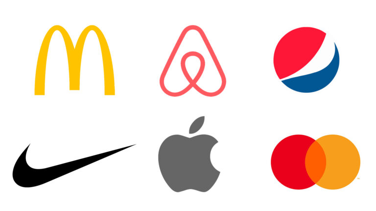
Consider the MasterCard logo: the merger of its two circles symbolizes connectedness and integration in our lives. This simplicity elegantly conveys the brand’s message without relying on intricate details. In a world flooded with information, a simple logo allows consumers to form a distinct and unambiguous image of what the business stands for, fostering a powerful and lasting connection between the brand and its audience.
Embracing Simplicity in Logo Design
The rise of Scandinavian interior design trends has underscored a valuable lesson: simplicity often wields more influence than complexity. In logo design, this principle holds. Present-day consumers find confidence in straightforward, uncluttered logos, which communicate a brand’s essence using basic shapes and colors. Such logos indicate that the brand’s reputation speaks for itself, relying on the power of simplicity to convey trustworthiness.
In the current landscape, logos function as symbols, akin to signatures or seals of verification, showcasing a brand’s ability to leave a distinctive mark on the industry. Unlike in the past, where logos aimed to tell a comprehensive story about a company before customer interaction, today’s logos serve as rapid snapshots of a brand’s image. They evoke specific emotions and memories, making a complex design redundant.
While some complexity can enhance certain aspects of brand identity, the modern approach emphasizes the elimination of elements that don’t add value or convey essential information to the audience. Evaluating every component of the logo becomes crucial. The question arises: why are logos simpler now? The answer lies in their unique benefits, ranging from instilling confidence in a brand to ensuring accessibility across diverse digital devices and platforms.
In the contemporary world, where simplicity resonates powerfully, logos thrive when stripped down to their essential elements. They become not just symbols, but statements — concise, meaningful, and universally accessible, embodying the ethos of the brand in a form that effortlessly connects with the audience.
![Premium Pricing Strategy [Pros, Cons & Top Examples]](https://naumandigital.com/wp-content/uploads/2023/10/WhatsApp-Image-2023-10-24-at-1.46.51-PM-600x400.jpeg)

![What is business strategy [Levels, Components, Examples]](https://naumandigital.com/wp-content/uploads/2023/02/2-600x400.jpg)
![The Common Person/Everyman Archetype [Explained with Examples]](https://naumandigital.com/wp-content/uploads/2023/10/WhatsApp-Image-2023-10-14-at-2.21.15-PM-600x400.jpeg)